The r + r Foundation
Date
October 2013
Media
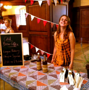
Packaged product
Objective
Develop strong branding to launch a range of bottled coffee into central London cafes.
Background
The r + r Foundation is a registered social enterprise formed to help fund grassroots community projects in London. For its first retail product, r + r opted to produce a range of bottled cold brew coffee. Prepared in icy water for 20 hours, cold brew offers a sweeter, less acidic alternative to traditional coffee that’s currently sold in very few places across the UK.
First I worked with r + r to understand their vision, business and product. This helped me establish my main goals for the project.
I then combined that understanding with my own research to establish the brand’s target market, and used that as the basis for the brand name and slogan.
Finally, I partnered with an illustrator to devise concept art that could show the brand’s potential.
The result
The r + r Foundation plans to launch Goodbeans coffee in April 2014.
See for yourself
Scroll down to see the evolution of the project.
The goal
To be successful, I recognised the need to:
- Create a brand name that spoke to the good intent behind r + r.
- Differentiate cold brew coffee from the competition—without dwelling on the science behind it.
The ideal consumer
My research, together with r + r’s own understanding of its audience, pinpointed a target market of 21-35 year-old self-confessed foodies, living in and around central London.
Keywords for this demographic included retro, geek, social and tech savvy.
The brand name
I wanted a name that spoke to both great-tasting coffee, and the good r + r is doing with it. I also recognised that it needed to be a single, identifiable word that could roll off the tongue—like Starbucks, Nero, or Costa. Goodbeans delivered on all fronts.
The logo
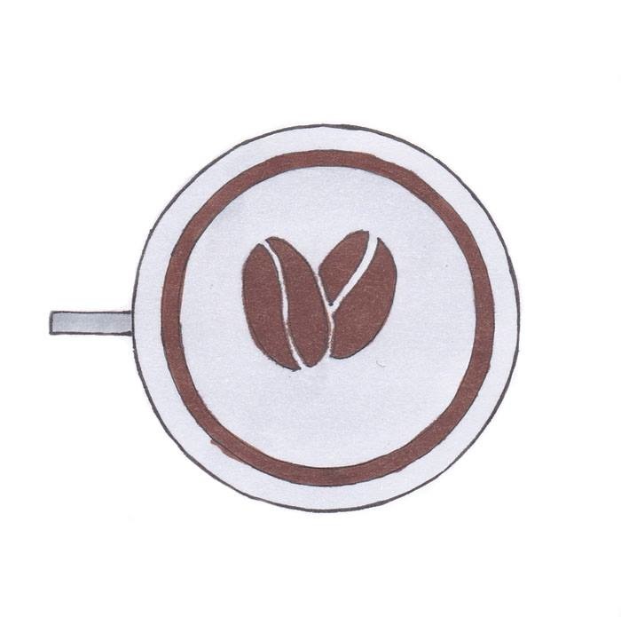
 Where most cold brew coffees go for the retro letterpress look, I wanted the goodbeans logo to stand out by staying clean, simple, and completely lower case. With the ‘double bean’ element I created a logo that’s instantly iconic, adaptable across colour palettes, and signifies the two seasonable beans r + r brews with, which change every four-to-six months.
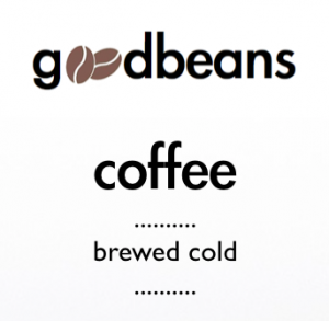
The product name
My research clearly showed the audience didn’t really get the distinction between cold brew coffee, and iced coffee. And yet, most similar products I found had the words “cold brew” as the focus of their product name. I proposed a subtle but important change. Call it coffee. Say it’s brewed cold. The idea was to shift emphasis to the Goodbeans name, making it a byword for that kind of coffee, like Pepsi is a byword for cola. In cafes, I wanted customers not to ask “Do you do cold brew?” but “Got any Goodbeans?”
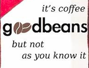
The slogan
Cold brew coffee isn’t like regular espresso. it’s prepared differently. It tastes different. I wanted a slogan which spoke to that point of difference, which the geeky, retro-loving target market would identify with. My solution was to paraphrase one of the most famous sayings in retro geek culture.
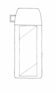
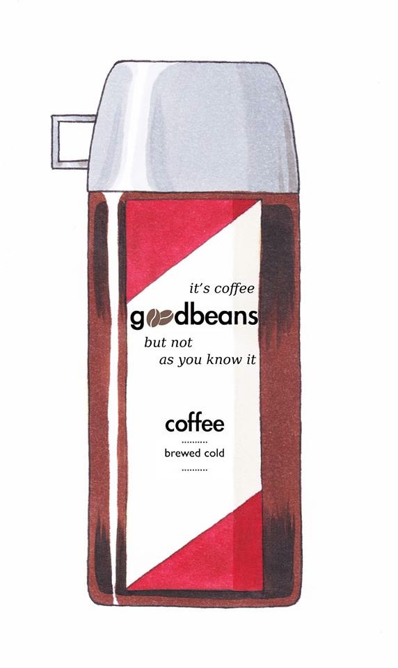
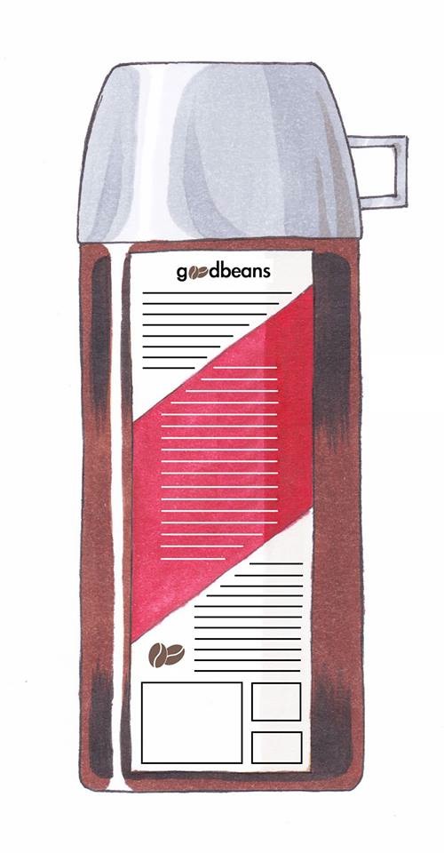
The bottle
To carry Goodbeans’ unique branding, I needed an equally unique canvas. So, putting my design background to good use, I dipped my toe into the world of product design. I opted for a bottle shape, made from glass, that echoes summertime picnics and school lunches. With a novel, nostalgic screw-on top that doubles as a miniature lid. I then partnered with an illustrator to bring the concept to life.
The finished concept
Topped with a silver cap instead of typical gold, the red and white label was inspired by a classic barber’s shop pattern.The final effect has a crisp, vintage feel—like the coffee itself.
Click the following thumbnails to view full size images: